Case study · 04 / 04

My
Account.

11 sections. 2 breakpoints. The first portal with true mobile parity.

Desktop & Mobile Sole Designer CURE Auto Insurance
Role
Sole UX/UI Designer
Company
CURE Auto Insurance
Scope
11 sections, 2 breakpoints
Platform
Desktop & Mobile
Tools
Figma · Component Library
— 01 / Context

The portal isn't just a feature — it's the product.

For policyholders, My Account is where the relationship lives.

CURE Auto Insurance's My Account portal is the primary destination for existing customers. It's where they manage their bills, their vehicles, their ID cards, their claims. For a company whose business depends on customer retention, this isn't a utility feature — it's the core product experience.

I was brought in as the sole designer to rebuild it across both desktop and mobile breakpoints: 11 distinct sections, two breakpoints, and for the first time in the portal's history — true mobile parity.

11sec.
Portal sections redesigned — Login, Home, ID Cards, Payment History, Policy Documents, Submit a Request, Add/Replace/Remove Vehicle, Submit a Claim.
2bp.
Breakpoints — desktop and mobile — both fully designed. Not just responsive. Actually designed.
Full Canvas Overview Zoomed-out Figma canvas showing all screens across both breakpoints — the full scope of the project at a glance.
11 sections, 2 breakpoints, 1 designer. The full canvas makes the scope visible in a way no summary can.
— 02 / The Problem

The classic three problems — and the screenshots told the story clearly.

Insurance companies redesign customer portals for the same fundamental reasons: the old experience is costing them money and trust. CURE's existing portal had all three of the classic problems.

Before
After
Home: two cramped columns, bullet-point nav list, no hierarchy, no icons. Cartoon mascot in the corner.
Home: surfaced critical info — policy status, upcoming payment, quick links to top sections. Scannable, prioritized, clear.
Payment History: plain three-column table. No status indicators. A block of instructional text next to it, competing for attention.
Payment History: chronological table with clear status indicators. Billing context in the right place. Instantly scannable.
ID Cards: a centered table with a download link. No prominence, no mobile consideration, no speed for a time-sensitive action.
ID Cards: card surfaced prominently, download/share optimized for mobile, multi-step nav eliminated.
Entire portal: zero mobile design. Not responsive — undesigned. Users got a shrunken desktop layout on their phones.
Every section fully designed for mobile — not adapted. Designed from the start with mobile behavior in mind.
How might we

…make a policyholder portal feel like a product worth coming back to — not a form you fill out under stress?

— 03 / Design Decisions

Three decisions that shaped the system.

Designing at this scale as a solo designer, the risk of inconsistency is constant. The decisions that mattered most weren't the flashiest — they were the ones that created coherence across 11 sections and kept the experience from drifting.

Decision 01

Rebuild the Home screen hierarchy from scratch.

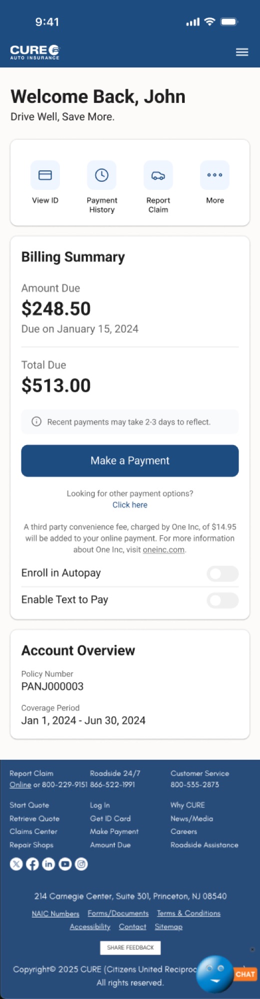
The Home dashboard is what every user sees first, every time. The original version was a two-column layout inside a bordered box — navigation was a raw bullet-point list with no visual hierarchy, no icons, no sense of priority. Users had no way to understand what was most important or what to do first.

The redesigned Home surfaces three things immediately: policy status, upcoming payment, and quick links to the most-used sections. Navigation was restructured to be scannable and predictable. The hierarchy was rebuilt so users can orient themselves instantly — instead of hunting for what they need.

Home Dashboard — Before / After Annotated hero shot: policy status surfaced, payment upcoming called out, quick-links to top sections prioritized by frequency of use.
The most impactful screen in the portal — not because it's complex, but because it's the one every user sees first.
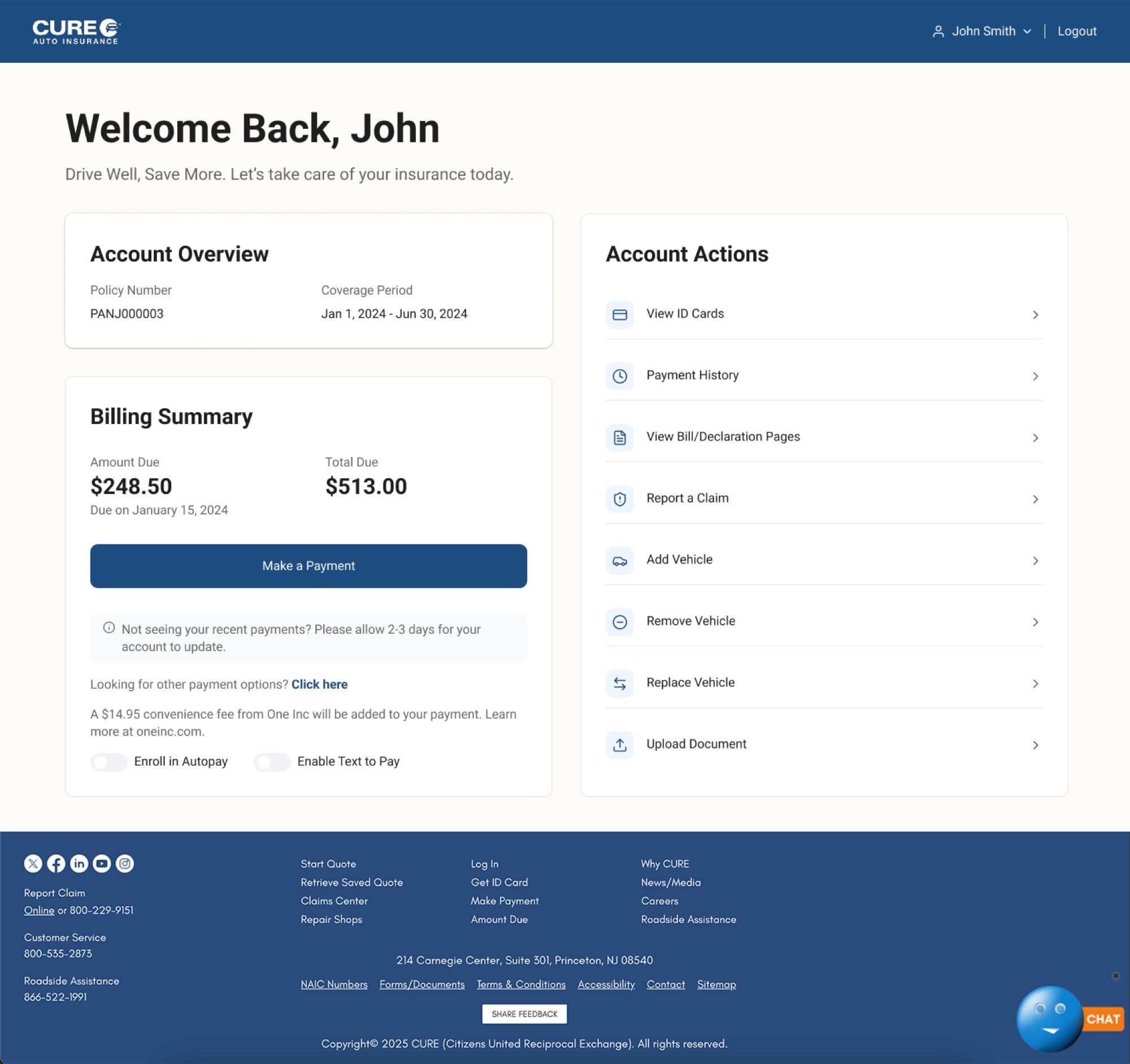
Finding what you need in two taps instead of five isn't flashy. But for someone at a traffic stop, it's everything. — Reflection on the My Account Portal project
Decision 02

Mobile parity — not just responsive, actually designed.

The original portal had zero mobile design. Users on mobile got a shrunken desktop layout — not adapted, not considered. This was the most significant structural gap in the entire product.

Designing for both breakpoints simultaneously isn't just about resizing layouts. Information hierarchy, navigation patterns, and interaction models all behave differently across breakpoints. A sidebar nav that works on desktop becomes a bottom sheet on mobile. A two-column desktop grid becomes a single-column mobile stack. Every one of these decisions was made intentionally — not as an afterthought.

Desktop vs. Mobile Side-by-Side Home, Claims, and Vehicle Management shown at both breakpoints — demonstrating how each section adapts without losing coherence.
Mobile parity isn't a checkbox. It's a completely different set of design decisions made in parallel.
Decision 03

Claims as a structured, calm process — not a form under pressure.

Submit a Claim is the highest-stakes flow in the portal. When a user is filing a claim, they're often stressed, often on a phone, and need absolute clarity above everything else.

The original claims flow had a progress bar — the only structured thing in the portal — but the form fields were densely packed with no breathing room. The redesign is step-by-step, calm, with one clear decision at a time. Clear progress indicators, logical field grouping, and reassuring confirmation screens guide users through the process when they're at their most anxious.

Submit a Claim — Step Sequence 6-step claims flow shown as a sequence — Getting Started, Driver, Vehicle, Loss, Additional Info, Confirm. One thing at a time.
Design for the worst moment — then it works for every moment.
— 04 / Design System

Consistency at scale is engineered, not accidental.

Across a project of this scope, a shared component library wasn't optional — it was what made the project possible. I maintained it throughout the redesign, ensuring that buttons, form fields, navigation elements, cards, and status indicators behaved consistently across all 11 sections and both breakpoints.

The portal covers a wide range of interaction patterns:

Login
Authentication Entry
Clean credential entry, clear error states, welcoming visual tone.
Home
Dashboard
Policy status, payment, quick links — rebuilt hierarchy.
ID Cards
High-Frequency Access
Surfaced prominently, download/share optimized for mobile speed.
Payment
Billing History
Chronological table, clear status indicators, scannable at a glance.
Documents
Policy Documents
Clean document library — clearly labeled, easy to locate and download.
Vehicles
Add / Replace / Remove
Three distinct flows, each optimized for mobile — confirmation states throughout.
Request
Submit a Request
Structured form flow, logical field grouping, clear confirmation.
Claims
Submit a Claim
Step-by-step, calm, one decision at a time — designed for moments of stress.
Component Library Buttons, form fields, navigation elements, cards, status indicators — consistent across 11 sections and 2 breakpoints.
A component-first approach isn't just good practice at this scale — it's what made developer handoff possible without a full-time design team supporting it.
— 05 / Outcome

The most comprehensive project I completed at CURE.

  1. 01

    Full portal redesigned across desktop and mobile — 11 sections, two breakpoints, every customer-facing screen rebuilt.

  2. 02

    Navigation clarity improved through a rebuilt Home screen hierarchy — policy status and payment surfaced immediately.

  3. 03

    Mobile parity achieved — every flow fully designed for mobile users for the first time in the portal's history.

  4. 04

    Self-service flows streamlined for vehicle management and claims submission — fewer steps, clearer confirmation, less confusion.

  5. 05

    Consistent component system maintained throughout — supporting clean developer handoff without a supporting design team.

— 06 / Reflection

What designing at scale actually taught me.

This project taught me what it means to design at scale as a solo designer. With 11 sections across two breakpoints, the risk of inconsistency is real and constant. Staying organized — through a disciplined component library, a clear file structure, and a consistent naming system — wasn't just good practice. It was what made the project possible.

I also learned that the most impactful design decisions on a project like this aren't always the most visible ones. Restructuring the Home screen navigation so users can find what they need in two taps instead of five isn't flashy. But for someone trying to pull up their ID card at a traffic stop, it's everything.

The job of a designer isn't to make things beautiful. It's to make things work. When they work beautifully, that's the craft. But work comes first.

Back to case study 01

A two-sided marketplace, designed end-to-end.