An ASAP job that actually means something.
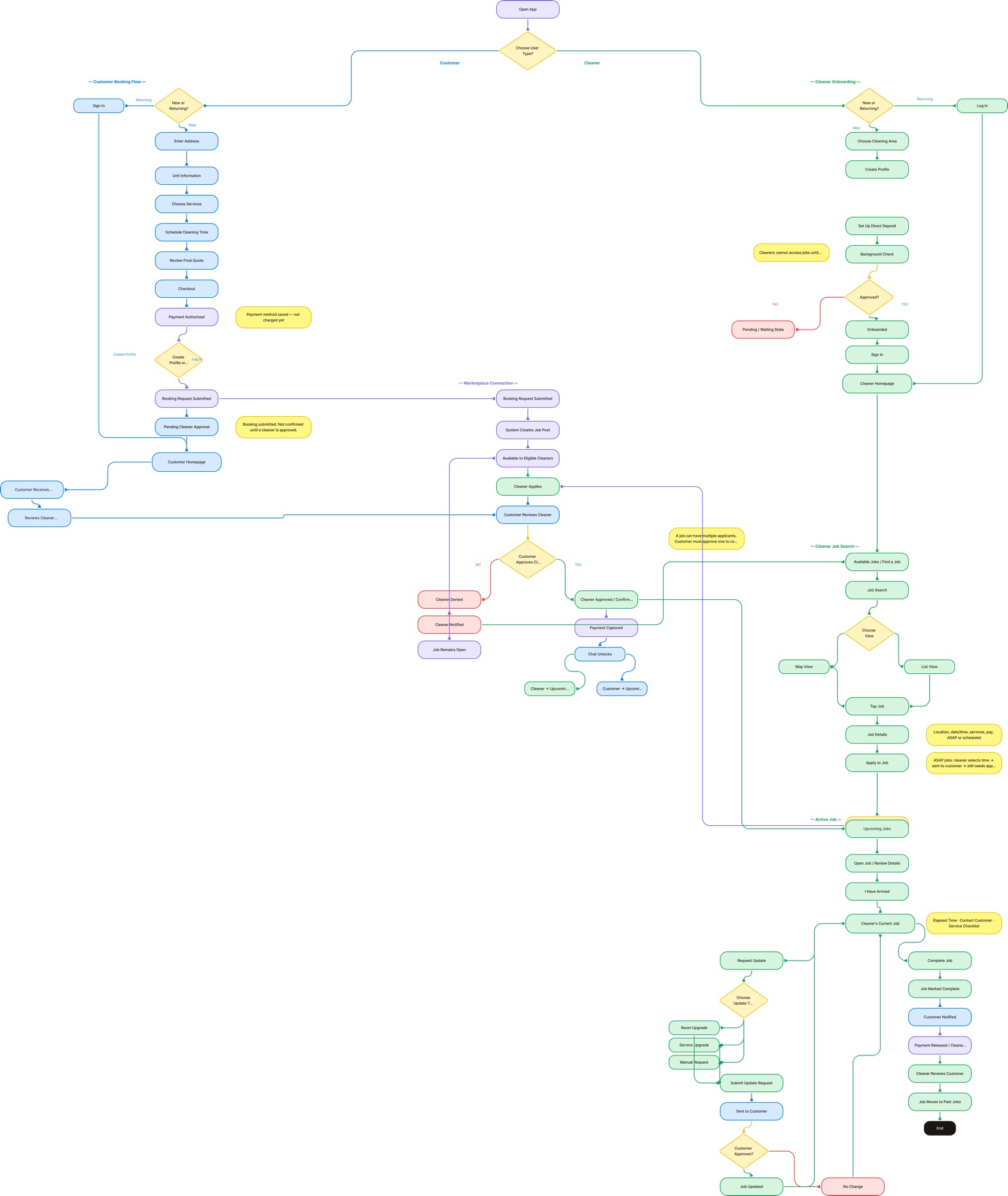
The stakeholder wanted an ASAP option. The brief was simple. The design question was harder: how do you give customers urgency without setting expectations the system can't reliably meet?
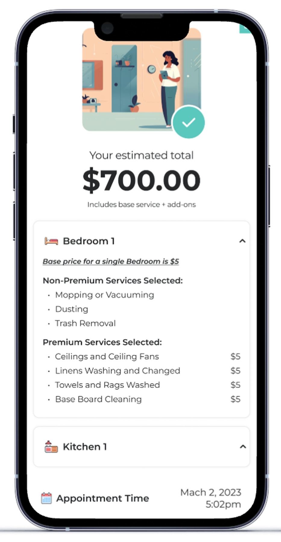
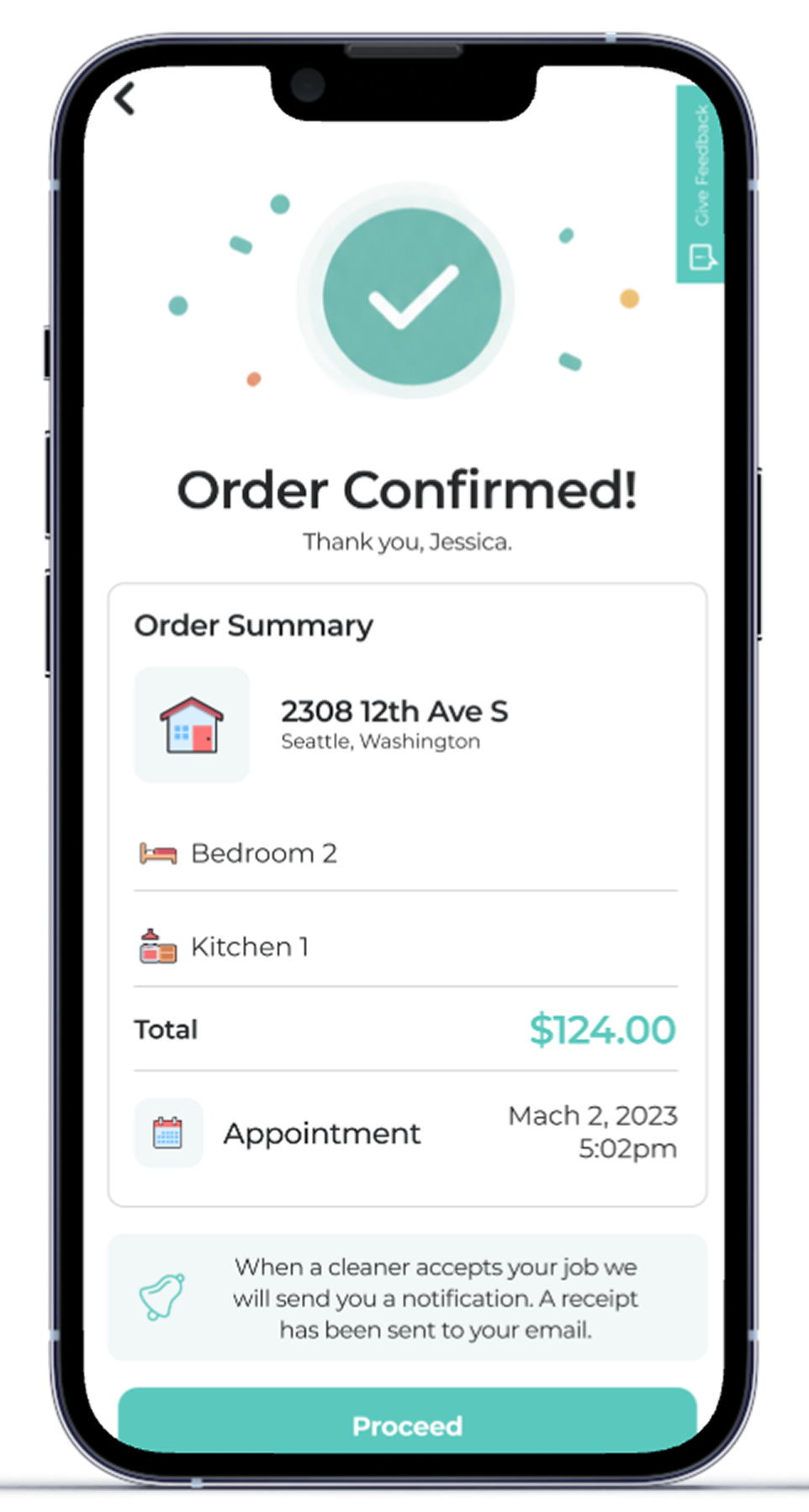
The decision: transparency over speed. Rather than a vague "ASAP — we'll handle it" label, the Schedule Clean Time screen explains the entire 5-step process before the customer confirms anything. They know upfront that a cleaner will propose a time, that they can accept it or suggest a new one, and that the cleaner confirms the final window. No surprises mid-flow.
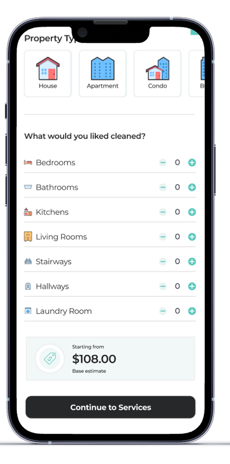
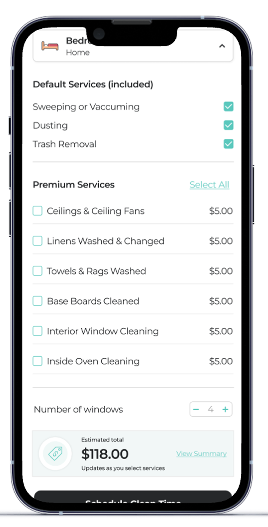
A secondary toggle — Within Business Hours or Anytime — gives customers meaningful control over the urgency window. Most ASAP features skip this entirely. It was a deliberate choice to treat the customer as someone who has constraints too, not just the cleaner.
This required designing both sides of the exchange: the customer-facing ASAP flow with its negotiation model, and a new bid submission screen on the cleaner side that hadn't existed before.