Case study · 02 / 04

Quick
Quote.

Halving a 20-screen quote flow — and shipping it to production.

Mobile & Web Sole Designer CURE Auto Insurance
Role
Sole UX/UI Designer
Company
CURE Auto Insurance
Timeline
Design Sprint → Production
Platform
Mobile & Web
Tools
Figma · Booleans · Variables
— 01 / Context

The quote flow is the whole funnel — if it breaks, nothing else matters.

No quote means no policy. No policy means no customer.

CURE Auto Insurance's Quick Quote flow is the primary entry point for new customers in New Jersey. I was brought in to redesign it from the ground up — modernizing the visual style, simplifying the experience, and reducing the friction that was costing CURE customers before they ever became policyholders.

The redesign also needed to accommodate a newly introduced Driver's License Scan feature as an optional accelerated path through the flow.

20→10
Screens in the redesigned flow — every screen doing one clear job, nothing redundant.
Shipped.
Approved by leadership and pushed to production — in active development for approximately a year.
Full Flow Mosaic All 10 redesigned screens in sequence — the new visual language at a glance.
Ten screens, each doing one job. The new flow moves — the old one made users work.
— 02 / The Problem

Twenty screens of manual data entry — and it showed.

The original Quick Quote flow had accumulated 20 screens of fragmented, redundant steps. Users were asked for the same information multiple times. Dense legal warnings appeared mid-flow with no visual separation. The flow ended by telling users to call a phone number.

  • 01

    Start Quote — Email, confirm email, zip code. Three fields, full screen.

  • 02

    Basic Information — Policy date and one dropdown. Full screen for a binary choice.

  • 03

    Coverage Selection — A full-page wall of legal text, mid-flow, no visual separation.

  • 04

    Applicant Information — Name, full address, housing status, two phone fields, email. One dense screen.

  • 05

    Driver Details — DOB in 3 separate dropdowns, marital status, gender, occupation, credit score range. All one screen.

  • 06

    Customary Drivers — License number and medical condition checkboxes on the same screen as driver details.

  • 07

    Driver Assignment (×2) — The exact same screen appeared twice in the same flow.

  • 08

    Applicant Information (again) — Same name and address fields from earlier, re-entered.

  • 09

    Vehicle Details (again) — More vehicle questions separate from the earlier vehicle screen.

  • 10+

    Thanks for Your Application — Flow ends by telling the user to call the office.

How might we

…make getting an auto insurance quote feel as fast and clear as any modern digital product?

— 03 / Design Decisions

Three decisions that restructured the experience.

Brand constraints meant the visual redesign had to stay close to what users already knew. That constraint pushed the real work onto the structural and interaction layer — fewer decisions per screen, clearer next steps, more consolidation without confusion.

Decision 01

Consolidating coverage into one screen.

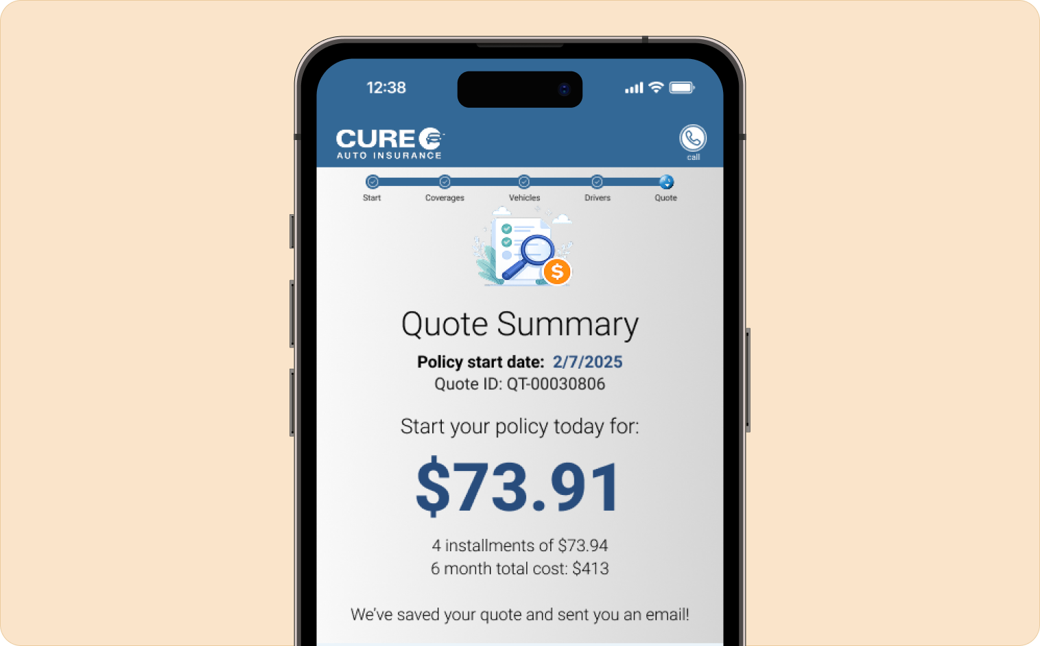
The original flow required users to navigate between multiple separate pages to review and adjust coverage. Making a change meant leaving the summary, going to a coverage screen, making an adjustment, and returning — adding friction at the moment of highest user decision-making.

The redesigned Adjust Your Coverages screen surfaces both vehicle and policy coverage in a single scrollable view. Each line shows pricing clearly. Users adjust without losing context of the full picture. One design decision, one fewer source of abandonment.

Adjust Your Coverages Vehicle coverage and policy coverage consolidated into one scrollable view. Pricing visible on every line. No round-trips between screens.
The most impactful structural decision in the redesign — two previously separate pages, unified.
Static mockups can be misread as "just a painting." A working prototype made the UX improvements undeniable. — Reflection on stakeholder review
Decision 02

Surface the quote before coverage decisions.

The original flow made users commit to coverage selections before showing them a price. They arrived at a total with no context for how it was assembled — creating anxiety and abandonment at the worst possible moment.

The redesigned Quote Summary screen surfaces pricing prominently and immediately. Users see their starting quote before making any coverage decisions. The total anchors the experience — by the time they reach coverage adjustments, the number isn't a surprise. It's a reference point they're actively working with.

Quote Summary Screen Price surfaced first — clear hierarchy, coverage context visible before users commit to any adjustments.
Price first, adjustments second. A different sequence that creates a completely different feeling.
Decision 03

One clear entry point — no ambiguous choices upfront.

The original Start Quote screen asked users to choose a quote type before they understood what that meant. Two option cards appeared simultaneously selected — a broken state that created confusion before the flow had even begun.

The redesigned entry screen collects only what's necessary to begin: one clear action, two paths forward. No asking users to make a decision they don't yet have context for.

Start Your Quote Clean entry — minimum required fields, one action, two clearly differentiated paths. No broken multi-select state.
First impressions set trust. The entry screen communicates competence before a word is read.
— 04 / Prototype Fidelity

A prototype that felt like the real product.

This project required a fully functional prototype for CEO and stakeholder review — not static mockups. I built a comprehensive component library using Figma's boolean and variable features for the first time on this project.

Every dropdown, toggle, selection state, and interactive element was a live component with real behavior. Leadership could click through the entire quote flow and experience the speed and clarity of the redesigned experience firsthand. A working prototype made the UX improvements undeniable.

Component Library — Boolean Components Dropdowns, toggles, selection states, form fields — all built as live Figma components with real behavior using booleans and variables.
The prototype didn't just look like the final product — it felt like it. That's what got it approved.
— 05 / Outcome

Approved by the CEO. Pushed to production.

  1. 01

    Pushed to production — the strongest possible measure of stakeholder confidence in a design.

  2. 02

    Coverage adjustment consolidated into a single screen, eliminating multi-page navigation at the point of highest user anxiety.

  3. 03

    Full prototype fidelity using Figma booleans and variables — secured leadership buy-in without ambiguity at CEO review.

  4. 04

    On-brand modernization — improved experience without disrupting the visual trust CURE had established with existing customers.

  5. 05

    Component library built and documented to support future iterations and clean developer handoff.

— 06 / Reflection

Working within constraints is a design skill.

My early explorations pushed the visual design further than stakeholders were comfortable with — more whitespace, bolder typography, a cleaner overall palette. The feedback brought me back toward the brand. Rather than fighting that constraint, I redirected my energy toward the structural and interaction layer.

The things users feel but don't consciously see: how many decisions per screen, how clearly the interface communicates what comes next, how much information can be consolidated without confusion. That's where the real redesign happened.

Building a fully interactive prototype using booleans and variables for the first time was a genuine skill unlock. It also reinforced something I now bring to every high-stakes project: when the stakes are high, the prototype has to be as close to real as possible. That's what gets things approved and built.

Next case study

20 screens to 6 — a 2-week sprint.